corporate UI/UX
for smart toilet remote
2020-21 for HUIDA
-
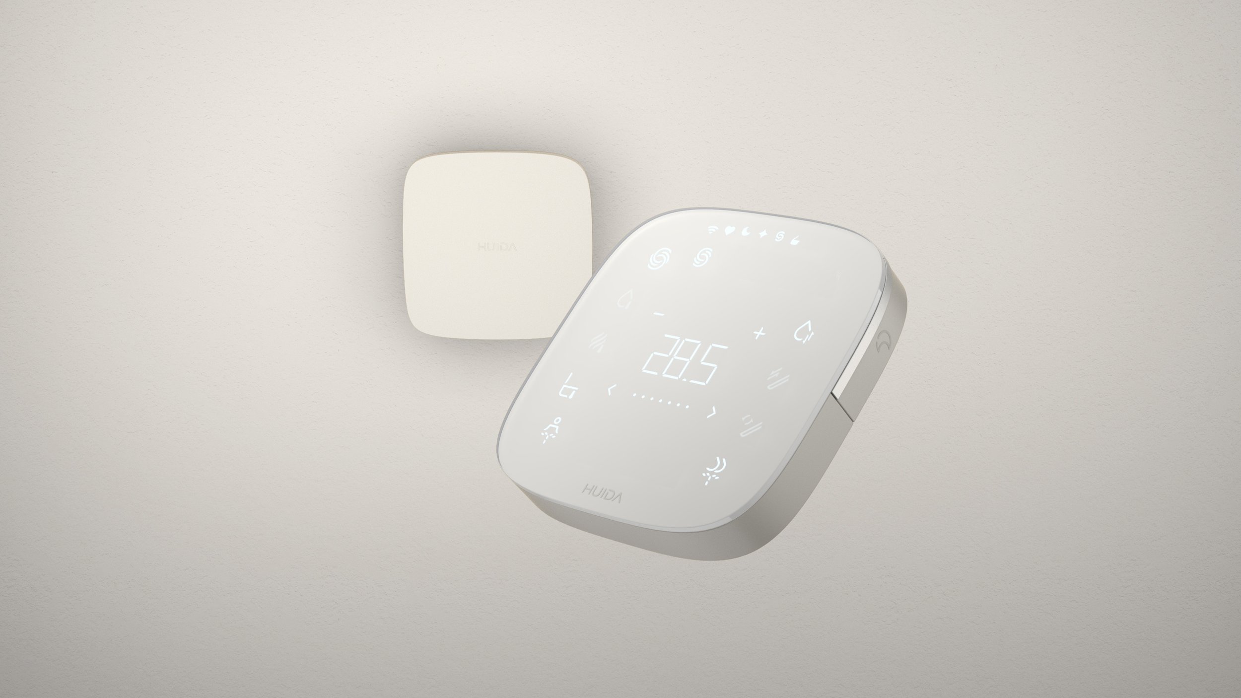
A streamlined UX flow reveals only the functions needed in each context, ensuring clarity and ease of use.
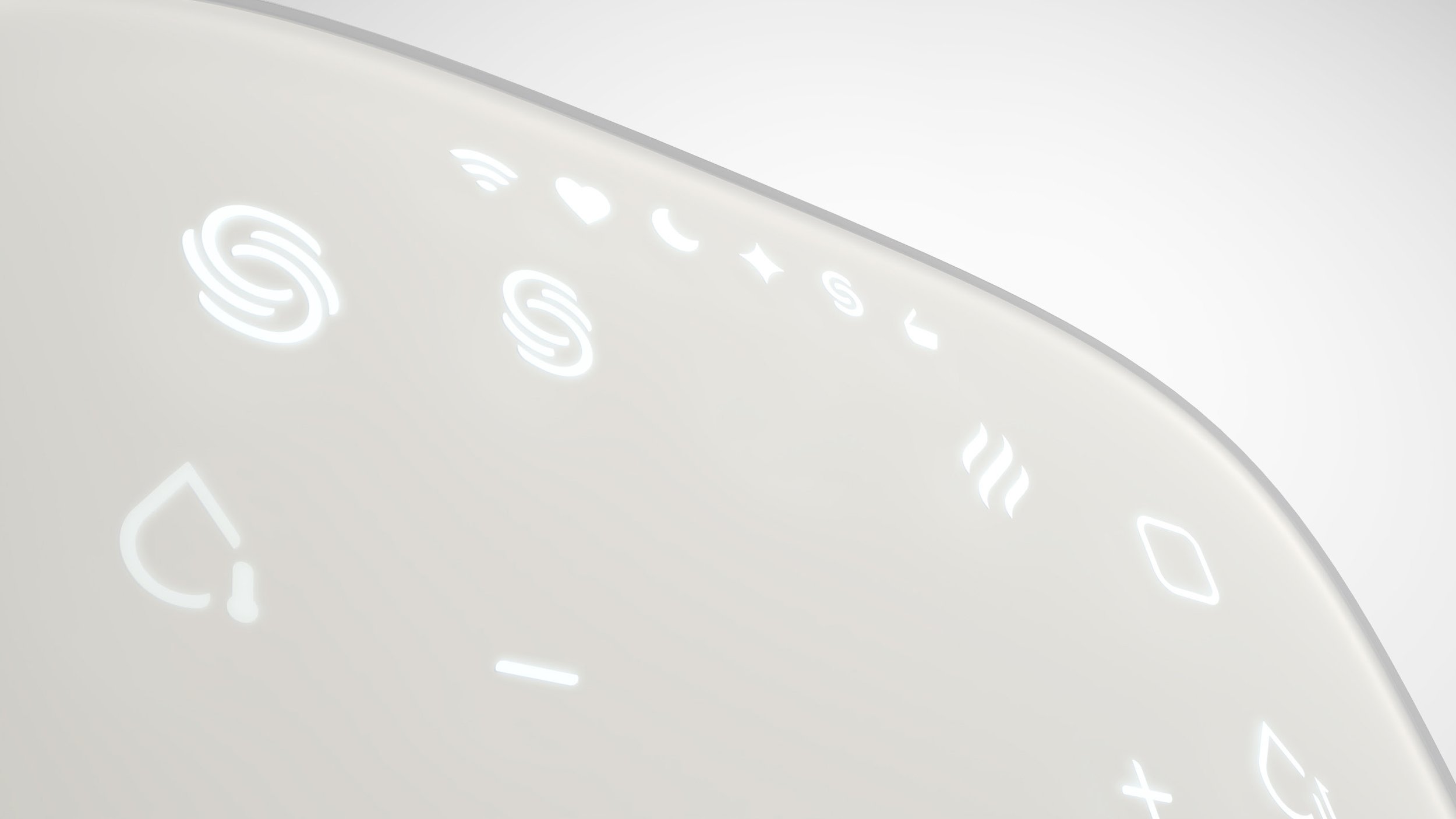
A custom-designed icon set reinforces HUIDA’s modern brand character and clearly differentiates it from the competition.
All of this is embodied in a remote designed to fit naturally in the hand while integrating seamlessly into the surrounding architecture. -
Designing a user experience that remains intuitive and simple, despite the high number of integrated features. Additionally, crafting an icon set that reflects a modern and distinctive brand identity.
-
During the development of the HUIDA Serenity bathroom series, a completely new smart toilet remote was created. This remote serves as both the control center for the current product and the foundational platform for HUIDA’s entire future smart toilet line-up.
-
Project lead & Art-Direction
Competitor analysis, design strategy with portfolio segmentation, briefing and art-directing the UI/UX design team, facilitation of internal brainstorming sessions, project management, stakeholder management
Team
Co-Art Direction UX/UI:
Taylor Vogel
UX/UI Designer:
Yishu Tan
ID Designer:
Lijie (Lele) Liu
CGI:
Changhsuan Pai -
This project was carried out when I was working full time as a designer for PHOENIX Design and all rights belong to the company.

brand identity driven UI design
The newly developed HUIDA logo features distinctive "incaps" at the ends of each letter. This design detail was carried through into the entire icon set, creating a strong visual link between brand and interface.
The icons themselves are modern and minimal, defined by smooth, rounded lines that give them a contemporary feel.


rethinking
standard icons
Japanese smart toilet icon sets dominate the market. With HUIDA, we challenged some of these standards—reinterpreting icons like "flush" for a fresher look—while retaining familiar forms for more complex or universally recognized functions.
designed for natural handling
The physical design offers generous surface area for both the icons and overall UI. Its shape is carefully balanced to integrate seamlessly when wall-mounted—similar in size to a light switch—while remaining comfortable and practical as a handheld device.

clear UX
architecture
& hierarchy

The UX is built around a clear hierarchy of functions and intuitive feedback. Frequently used actions are placed as physical buttons along the edge of the remote for instant access, while secondary features are organized within a structured on-screen menu. This layered architecture ensures ease of use without overwhelming the user.
scalable
design

The UX and hardware design were created to scale from premium to entry-level models, ensuring a consistent brand experience across the entire product line. The high-end remote can be adapted into a simplified version—fewer physical buttons, minimal elements, and reduced functionality—while maintaining the same design language.

Bathroom series for HUIDA

Premium bathroom series for HUIDA (confidential)
Bathroom series for HUIDA

Portfolio Design DNA for V-ZUG

Smart Glasses for Emteq Labs

Flagship Suitcase for XIAOMI /90FUN
Future design DNA for Sennheiser (Confidential)

CMF design for Sennheiser (coming soon)